
Posted by E. David Man
e-Contents Design Portfolio
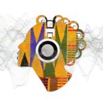
![]() The Quirky Logos design project was a unique opportunity to showcase my creativity and design skills. Working with the client’s specified colours of orange, green, and black, I aimed to create logos that would capture the essence of their business. Extensive research ensured the designs were visually appealing and aligned with the client’s preferences and values. The challenge was to convey warmth and simplicity while maintaining a quirky edge to distinguish the logos from the competition.
The Quirky Logos design project was a unique opportunity to showcase my creativity and design skills. Working with the client’s specified colours of orange, green, and black, I aimed to create logos that would capture the essence of their business. Extensive research ensured the designs were visually appealing and aligned with the client’s preferences and values. The challenge was to convey warmth and simplicity while maintaining a quirky edge to distinguish the logos from the competition.
Each colour was carefully considered in the logo designs, either used individually or blended to create an eye-catching effect. The combination of orange, green, and black created a sense of energy and vitality that perfectly captured the spirit of the business.
My focus throughout the project was on delivering a unique and memorable set of logos that would stand out in the marketplace. From concept to completion, I drew on my experience to exceed the client’s expectations. The result was a cohesive set of logos that conveyed the sense of friendship and simplicity the client desired.